Finding My Illustrative Voice
Hello everyone! I hope you have enjoyed your fall and had a good thanksgiving. I thought I’d show you what I have been working on over the last couple months. I have shifted gears a bit and hadn’t made any new block prints, but I’ve been working hard to unify my drawing style, specifically my digital illustration. As some of you may know a big goal of mine is to get into book illustration. I’ve been working on my digital illustration a lot this year. I have been trying styles and different ways of illustrating, but nothing seemed to show my unique voice and looking at the work there was a disconnect between that and my printmaking. My goal was to have both works have a similar tone and be recognizable that the same artist made them. After about 10-11 months of Illustrating things I think I finally found a way of illustration digitally that represents my unique style and has similar accepts to printmaking. But before I show you the end result lets go on the journey together on my evolution progress!
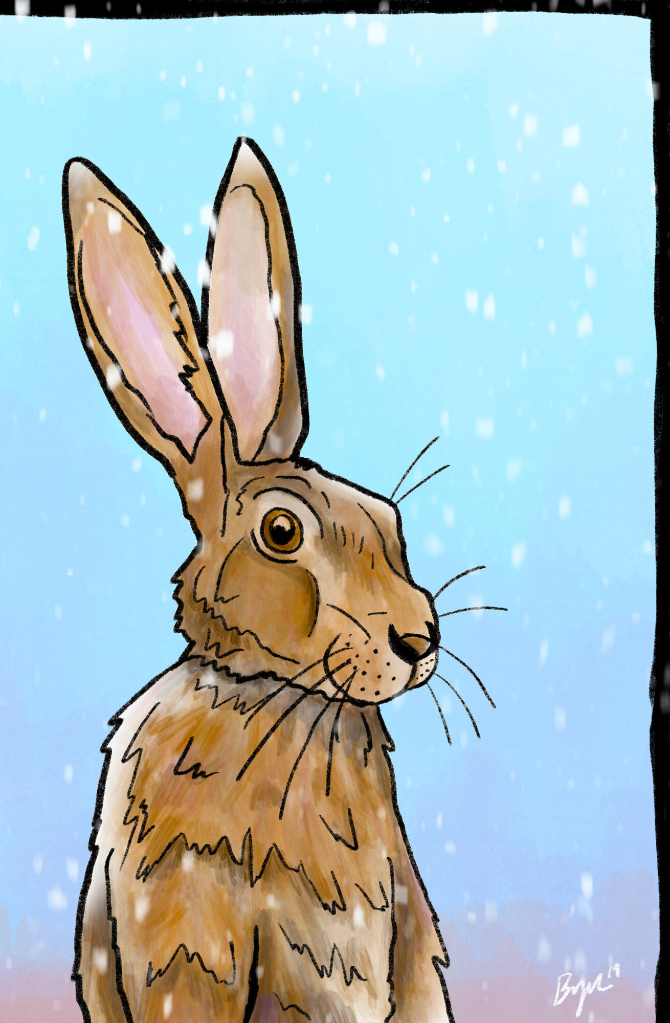
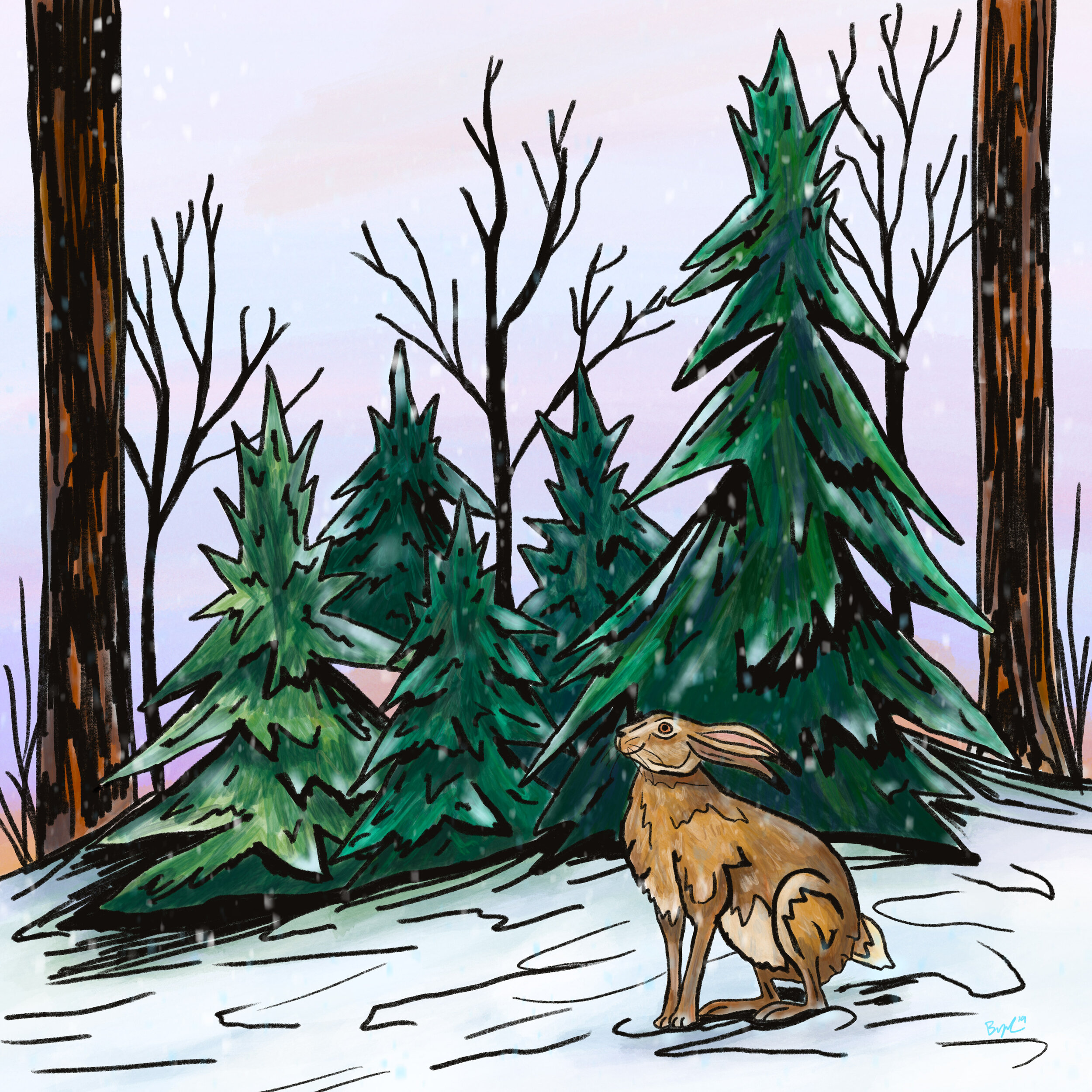
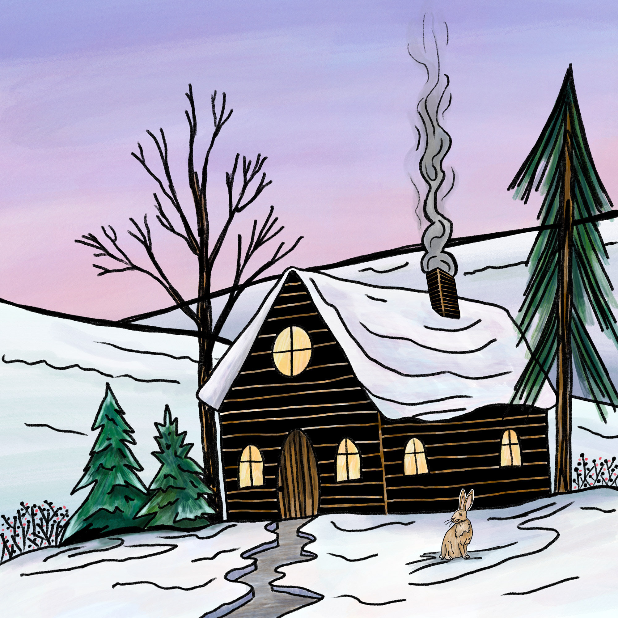
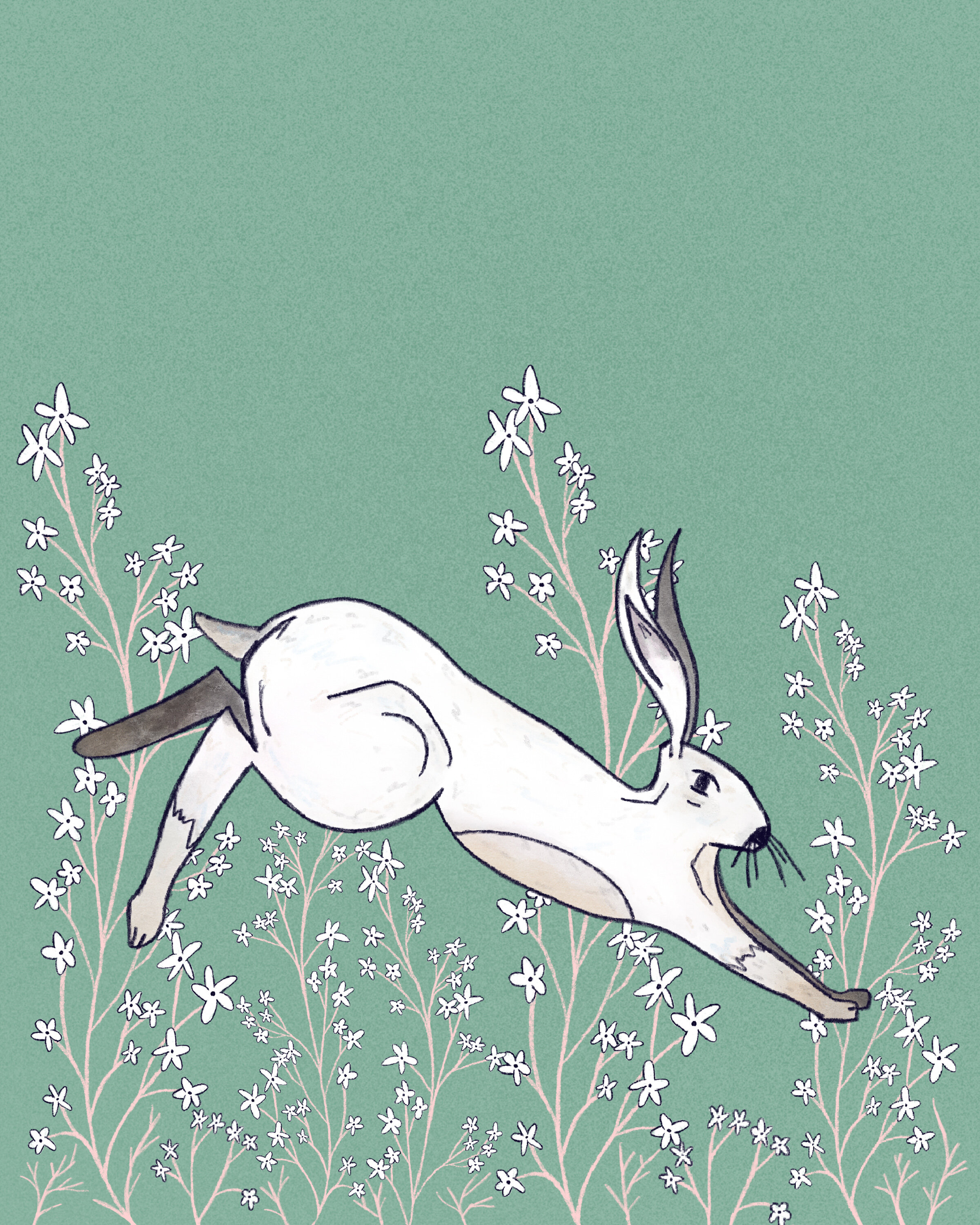
To start, I really have to go back to the end of 2019 I illustrated several scenes from an idea I had about a winter rabbit. I was practicing for making children’s book illustrations. This looking back is probably the closest to what I developed now and my method fro illustrating is pretty similar. All of my illustrations are done in Procreate on my iPad then taken into photoshop for the final touch ups and finish out. I went about illustrating these by using the 6b pencil brush(something I’ll use a lot going forward) and drawing out the scene, treating it like a block print but being a little more loose and illustrative with the drawing. After I finished the drawing, I made a new layer and found the watercolor brush and added some layers of watercolor to the illustration. This was like what I do in my printmaking, after I print the block, go back and watercolor the print. Initially I was happy with the result of these illustrations, but to me it seemed to digital. There wasn’t enough texture to them, and the watercolor paint brush digitally just doesn’t come across the same. So I decided to try something new.
Starting now at the beginning 2020, I would say I tried three different illustration styles. The first thing I did was research, I looked at illustrators, artwork, styles, and saved what stood out to me. I then made a few quick drawings in that represented style, and then progressed. I will show you how each style, how they evolved, and finally how it all merged into finding my style that represents my artistic voice.
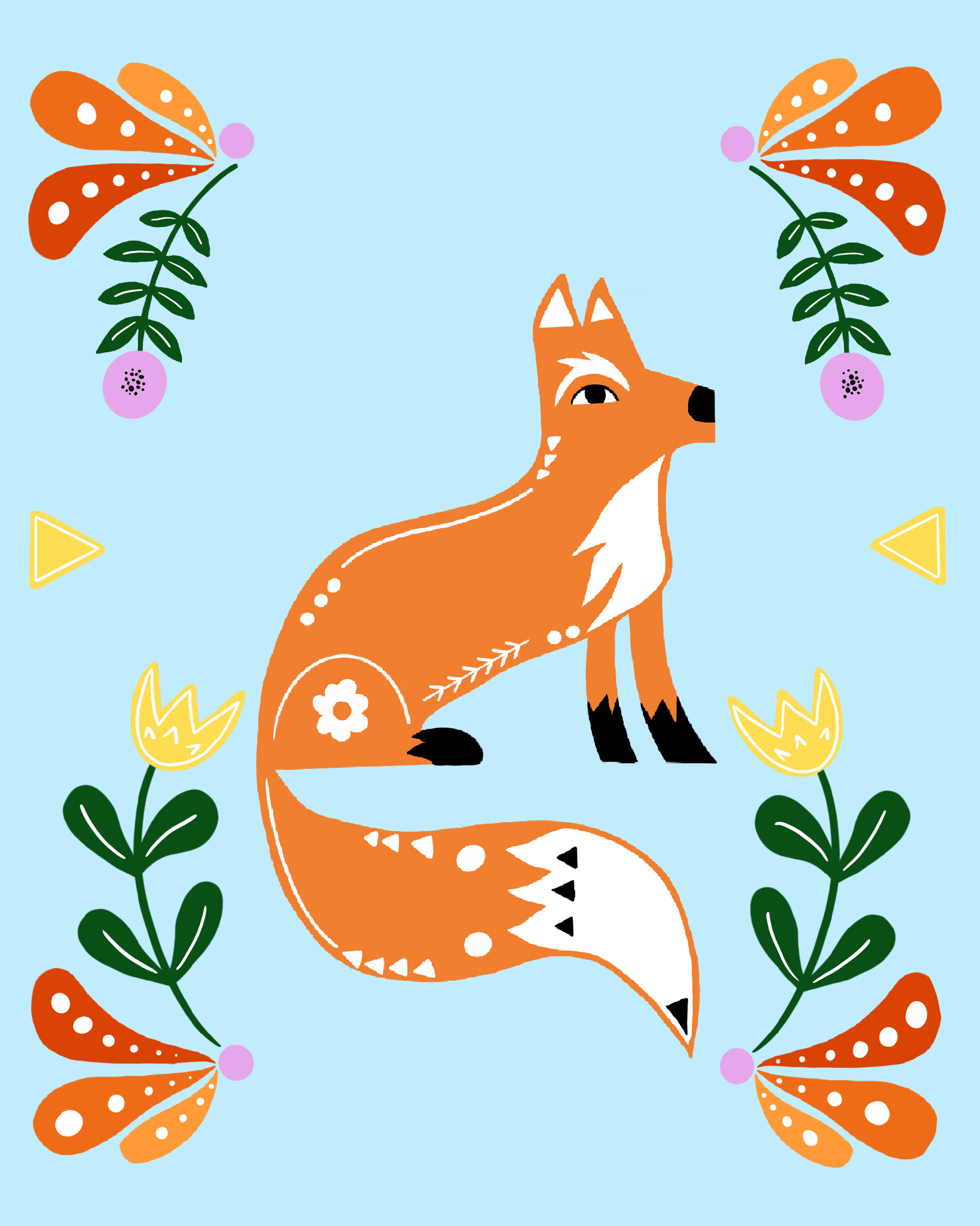
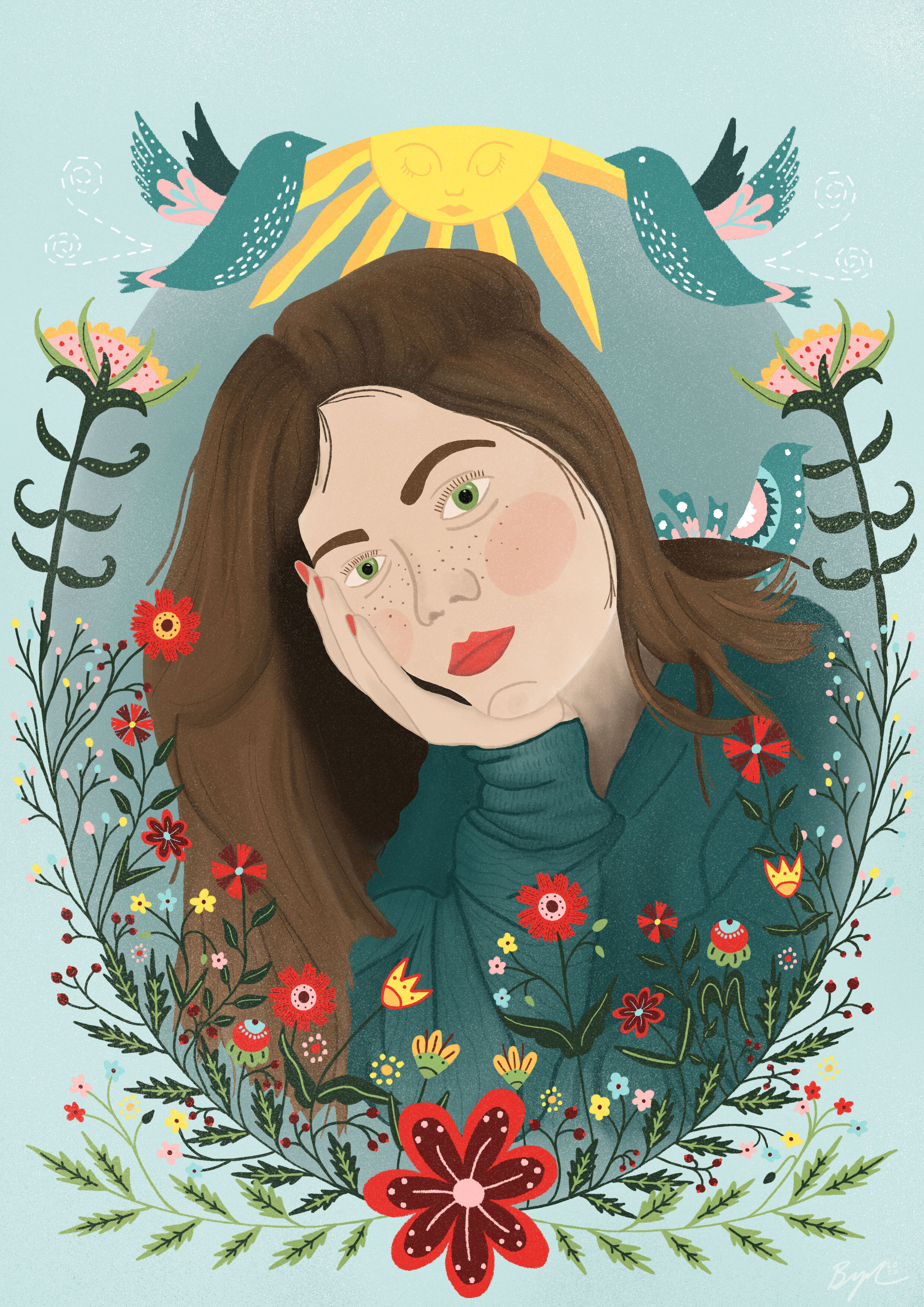
Folk Style- The first style I’ll show you through the year of illustrations. I have always enjoyed folk art and the simplicity of it, as long with the color pallet. I made a couple very folky illustrations and progressed from there. The progression took me to make a couple portraits, I was working on that anyway. I took some elements from the classic folk style and adapted to something that fitted me more. I then took another step forward and treated it more like a block print (hint, that will be a key through out my years progress).
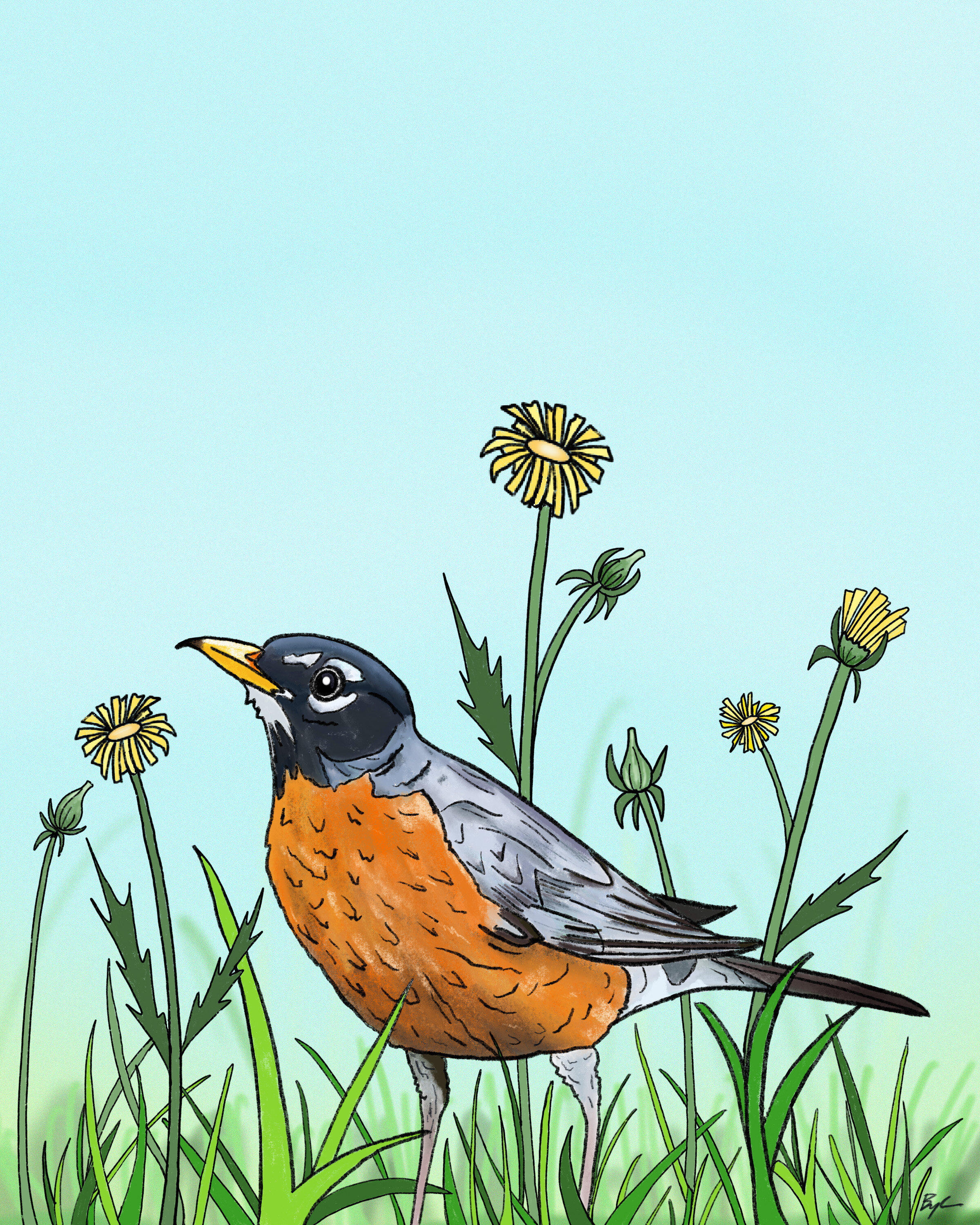
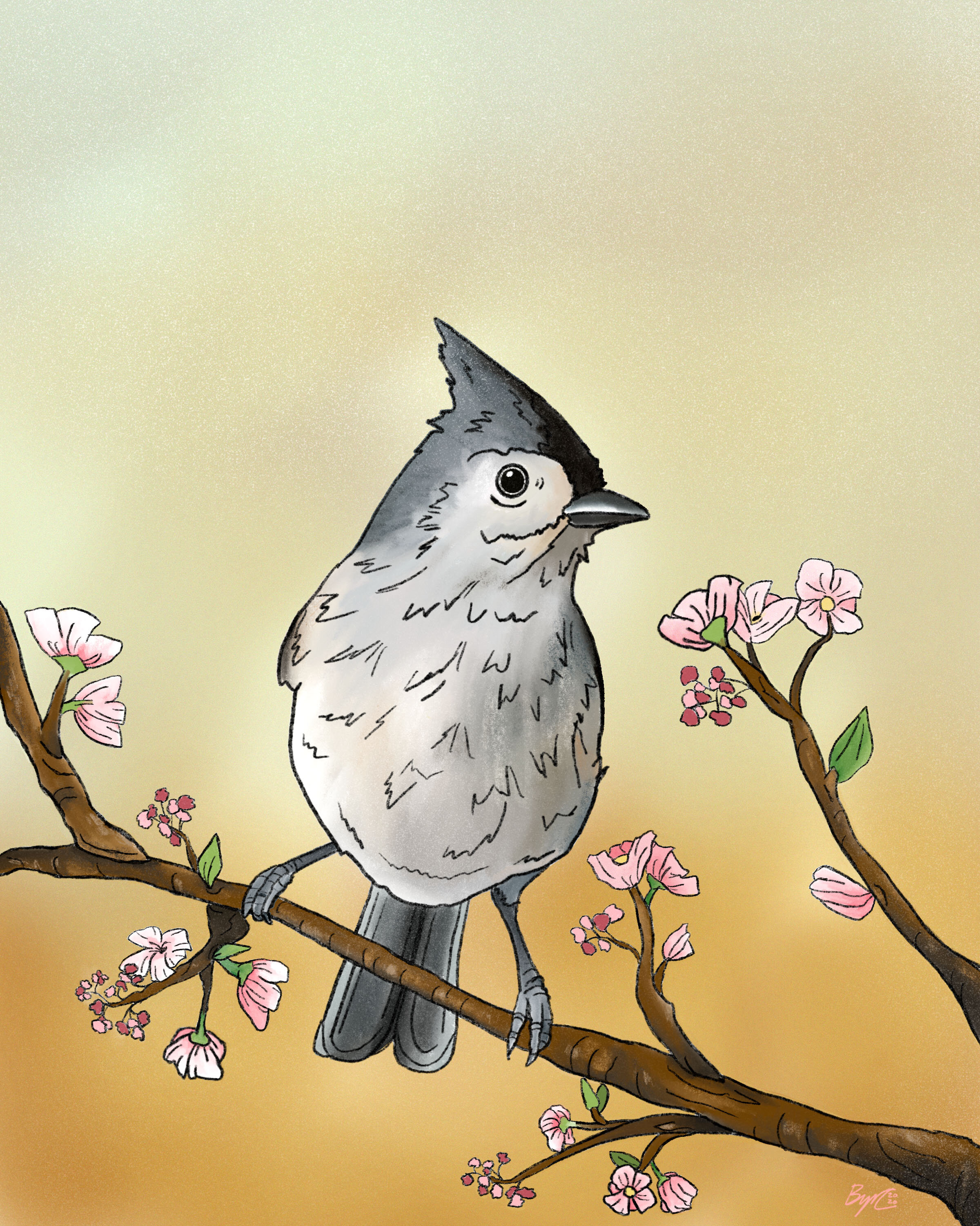
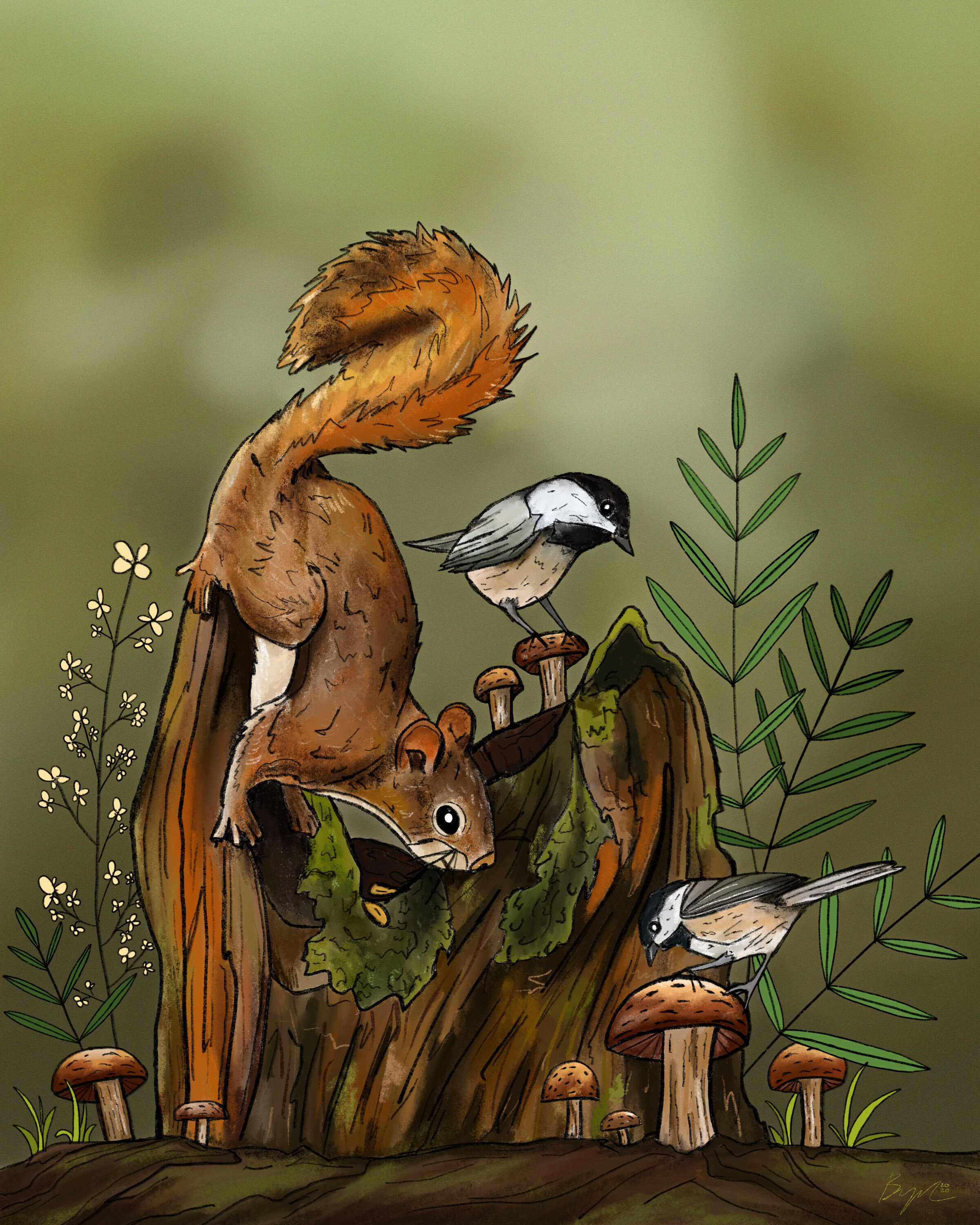
Simplistic Outline- This style was probably the one a made the most art, and the one I was thinking I would settle with. This style was very simple. I would do an outline drawing using the 6b pencil in procreate, I simplified the drawing to mainly lines, and some details. Then I would color in the image. I liked these illustrations, but as i did more of them I noticed they lacked something, they just weren’t really connecting with me. I do have one exception, I made a illustration of what I call “The Woodland Stump” this was in the same style, however I increased the detail and it shows. When looking back on it, I should have developed that more, but It tool me about 10 months to realize that! haha
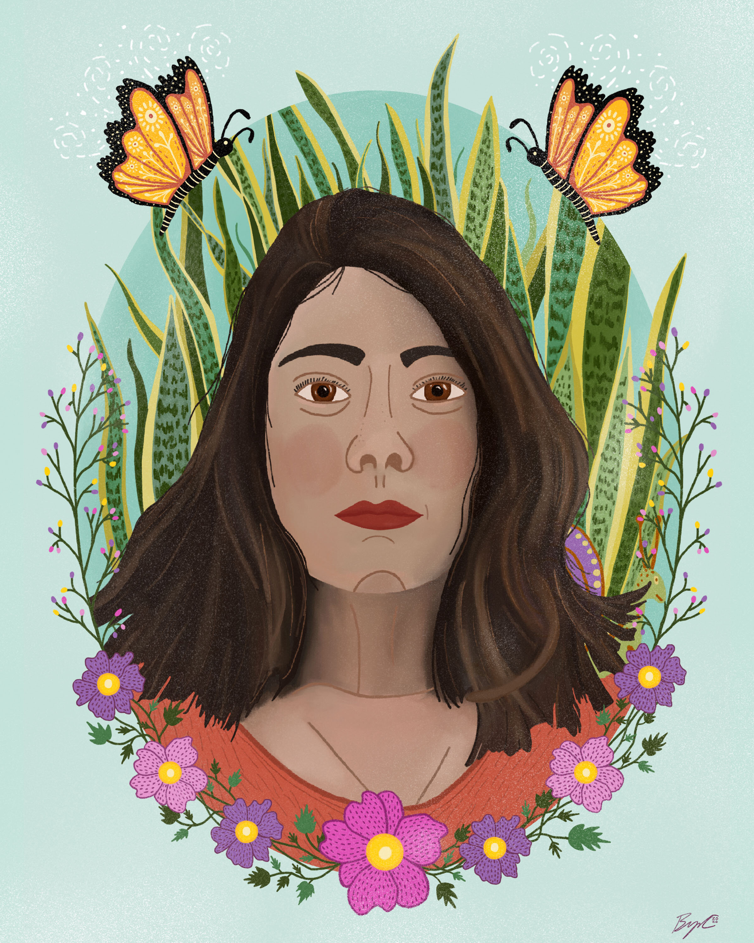
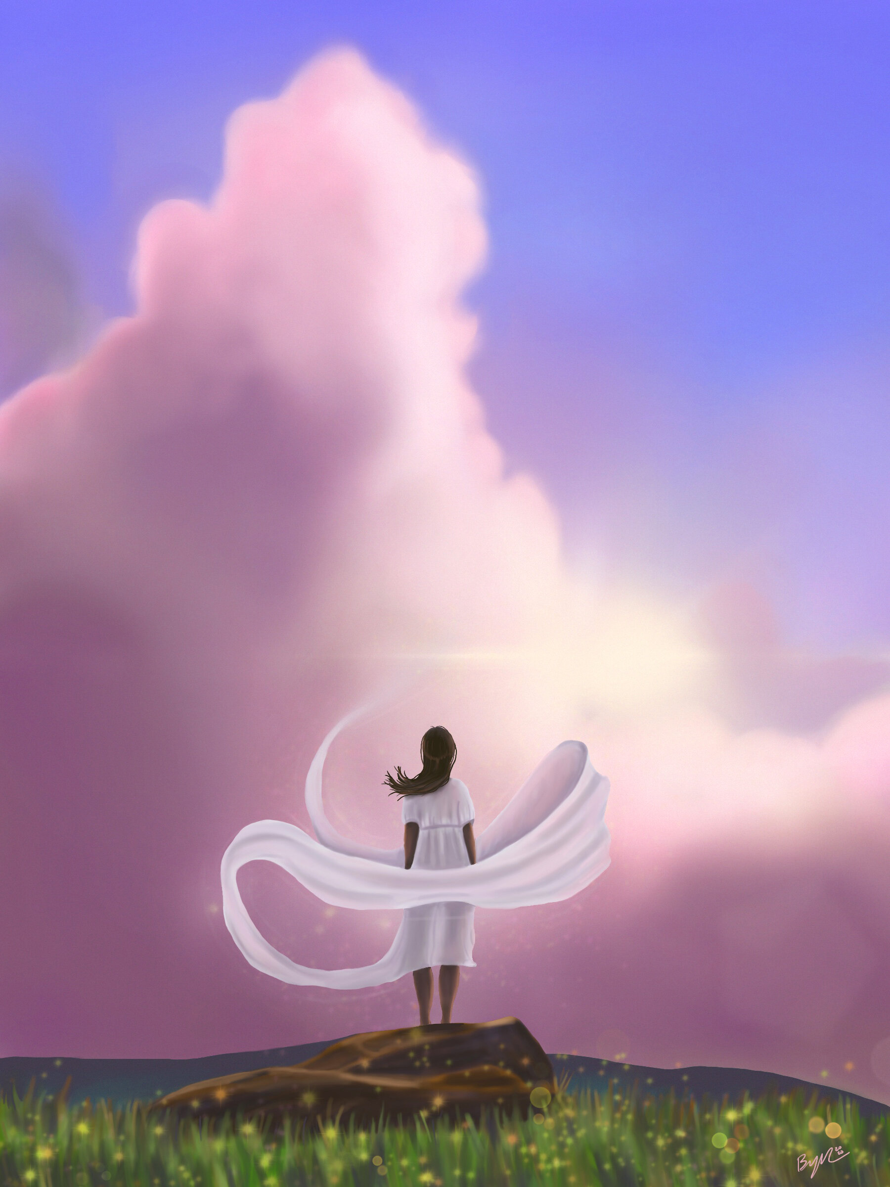
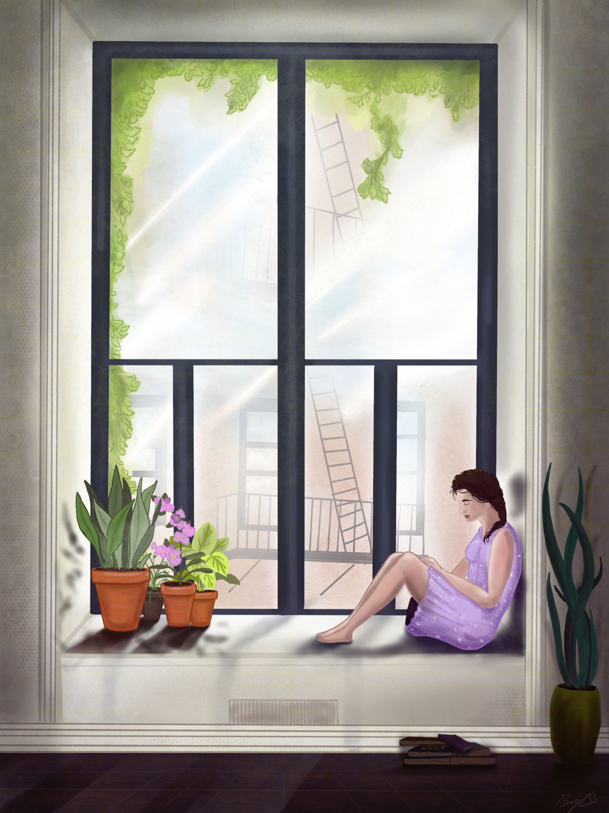
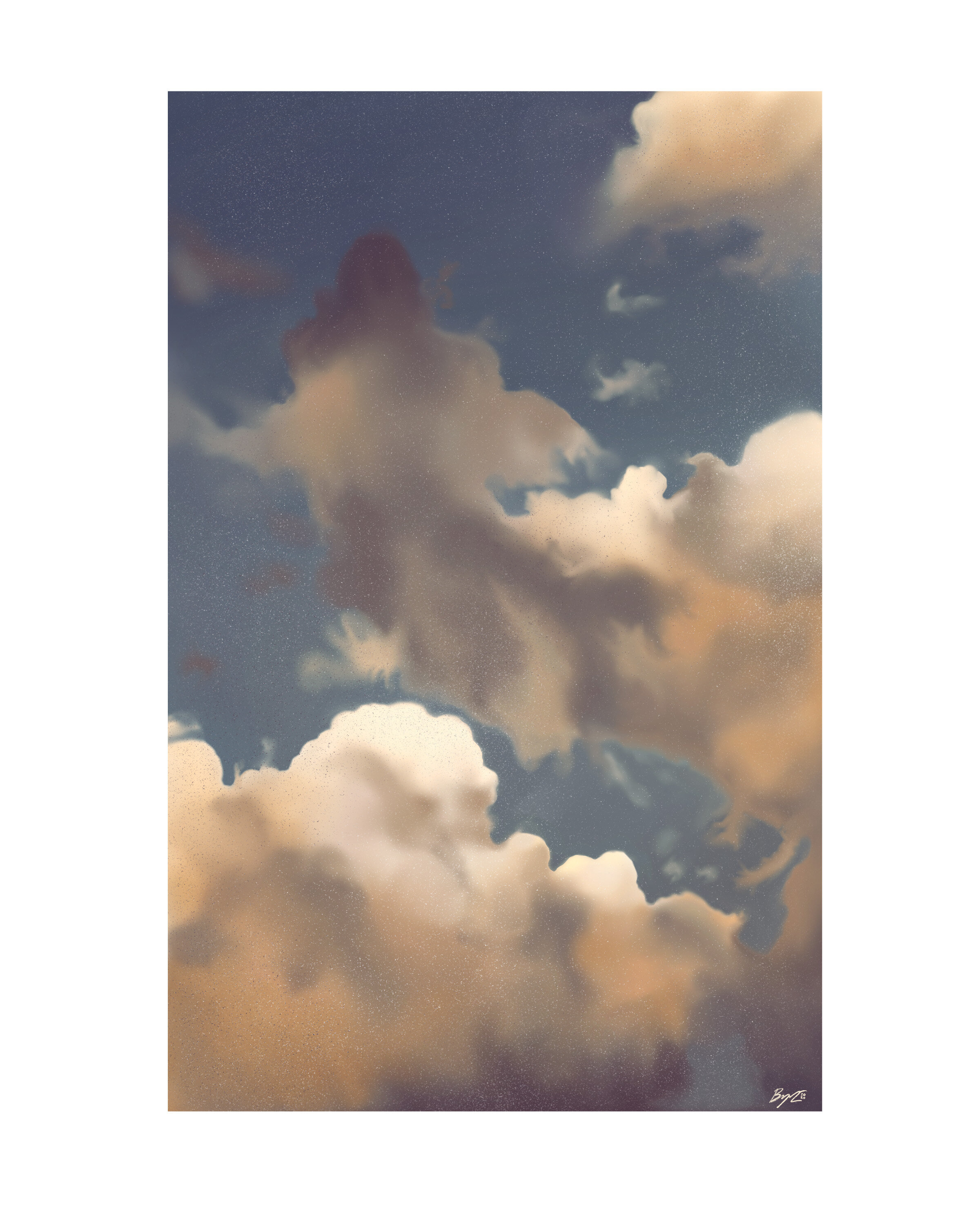
Full Digital- I don’t know how to exactly describe this next style besides maybe typical digital illustration using round brushes and texture pieces. The biggest thing for me on these pieces were how different the process and style was from how I normally illustrate. With that being said these pieces were more conceptual and I enjoyed making pieces more conceptual that challenged me more than the nature scenes. I would like to take this into the style I developed but I haven’t had a chance quite yet. This illustrations focus on softness, light, hope, and appreciating the small things. I made these in the spring during the start of the Covid Pandemic.
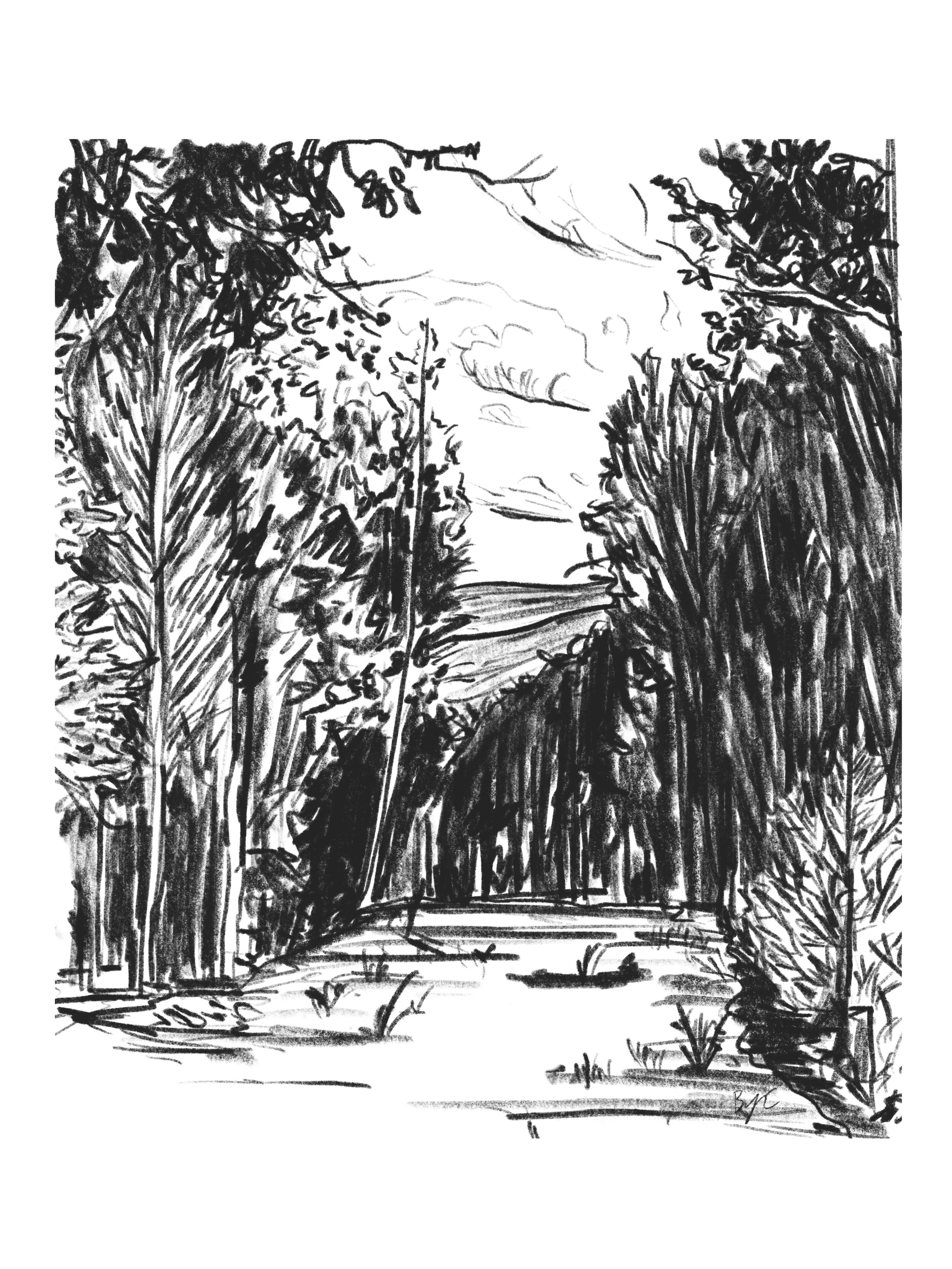
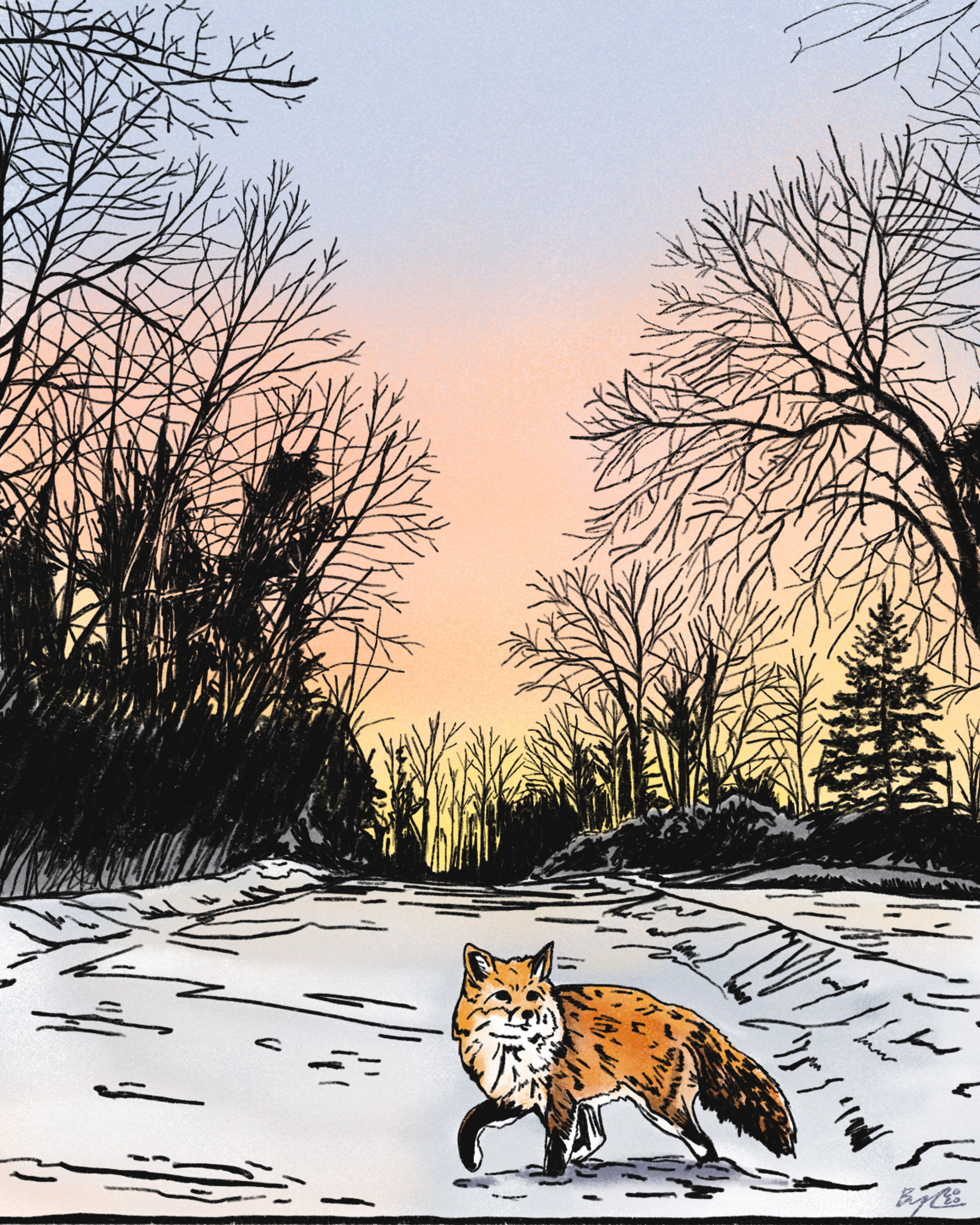
The Transition- In the summer after moving I thought I try something fun, I found some photos I taken over the spring and early summer around CT. I wanted to make real loose sketches, but keep in similar to a block print. I ended up really liking them and used it as a base for my final progression into my style.
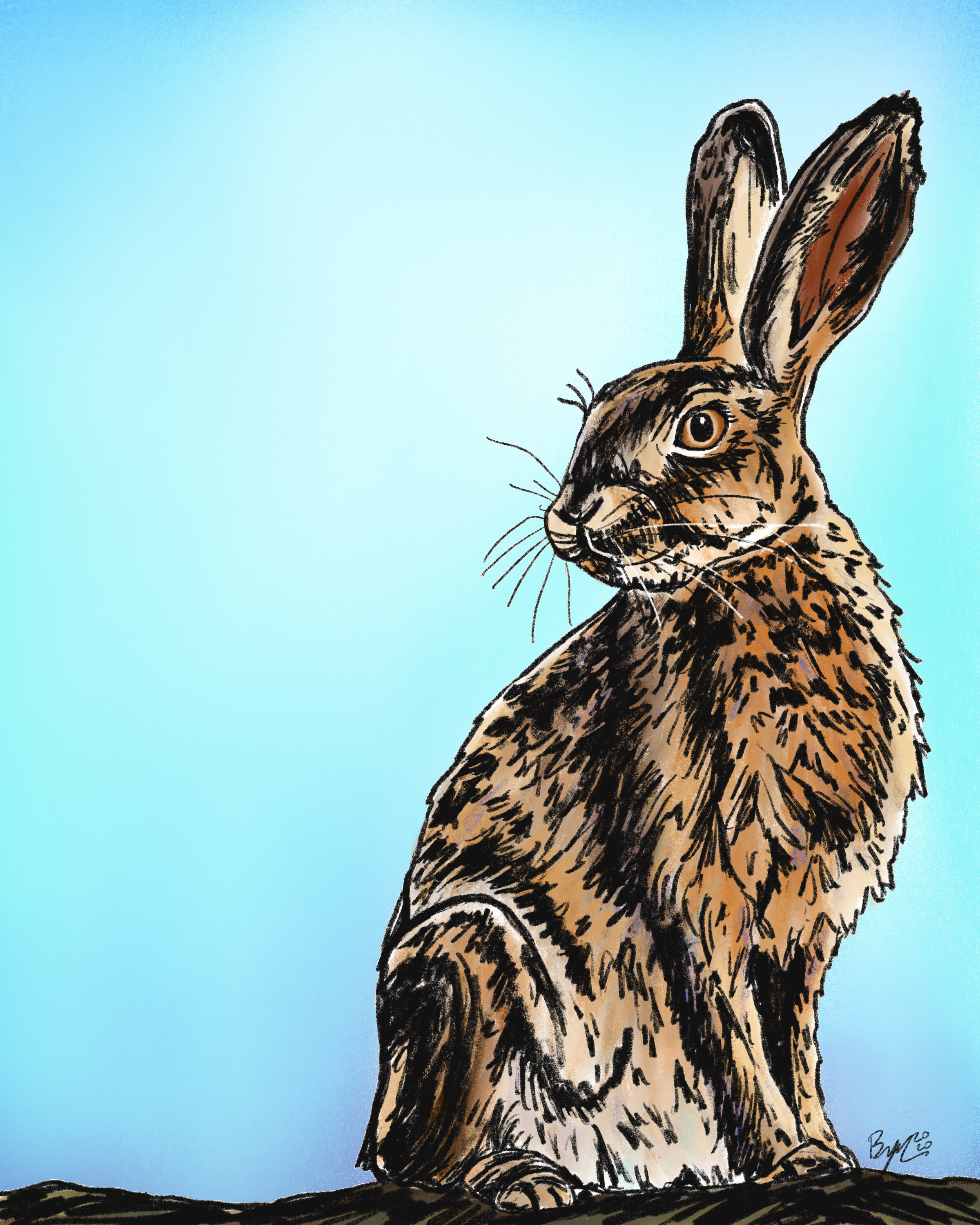
Putting it all together- So this brings us to the now the fall. I took an Illustration class and part of that class was finding or developing your style. Initially I thought, of course I have a strong style. But thinking more about it, I realized I do have a strong and developed style for my printmaking, but my digital illustration was still lacking. If wanted to progress more into illustration I needed to nail it down. I was on Instagram scrolling through, I must of came across a multi color block print, I don’t remember the image, but I had and idea! What if I treat my digital illustration more like a block print, or like a multi color print. Thus began my final chapter into developing my style.
The first print I made was based off a photo I took of our maple tree right outside our house. It was fall then and the colors on the tree were beginning to change. For this illustration I kept with the 6b pencil brush, treating it like a block print this would be the key layer. Taking a bit from all I learned, I was a little more loose with drawing but it was closer to how I draw for a block print piece. After that layer I made several other layers for the colors. I decided to simplify the color. Having them more blocky and less blended. This would give more of a printmaking feel. Here is the progression of the layers below. You can see how the piece come into life!
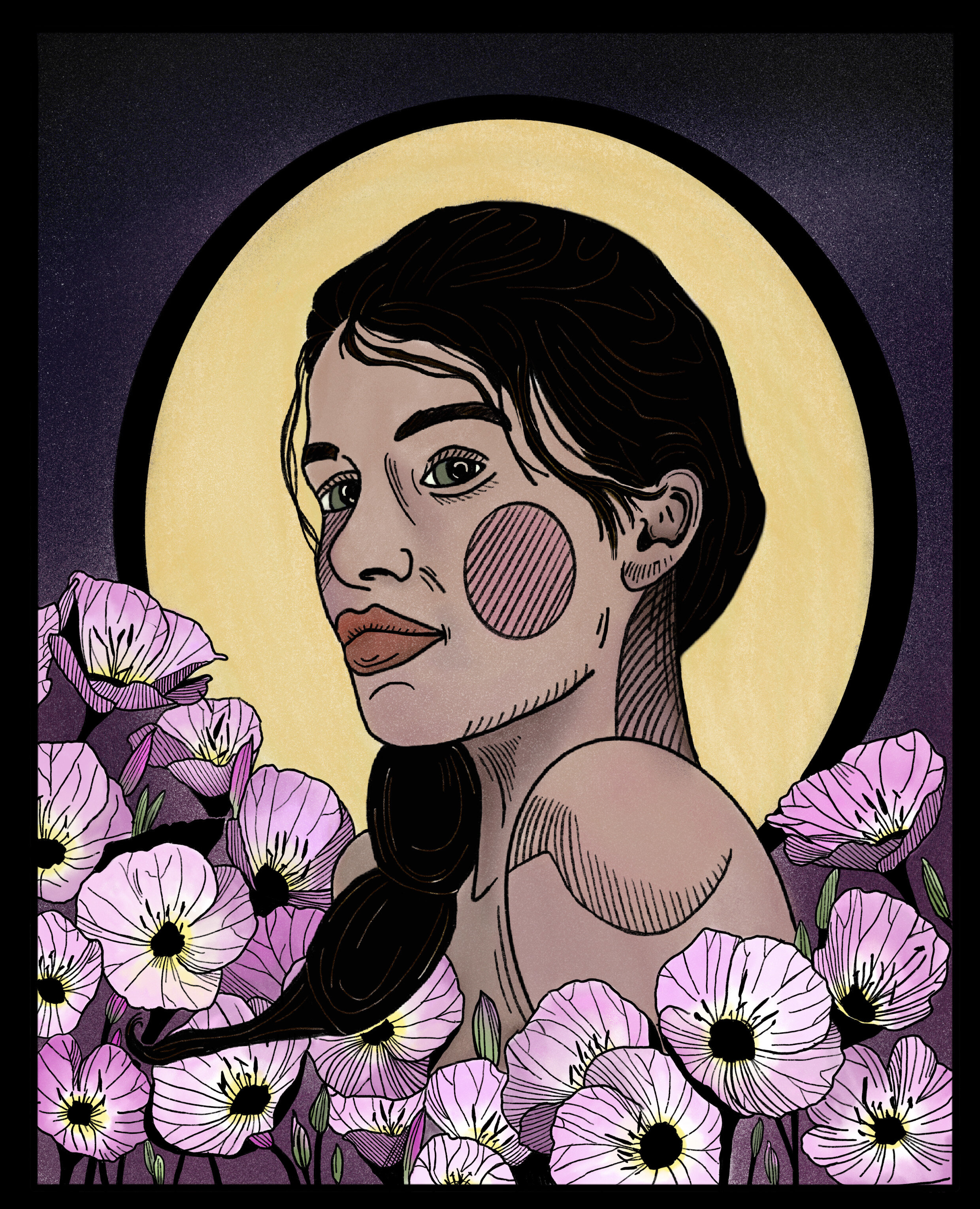
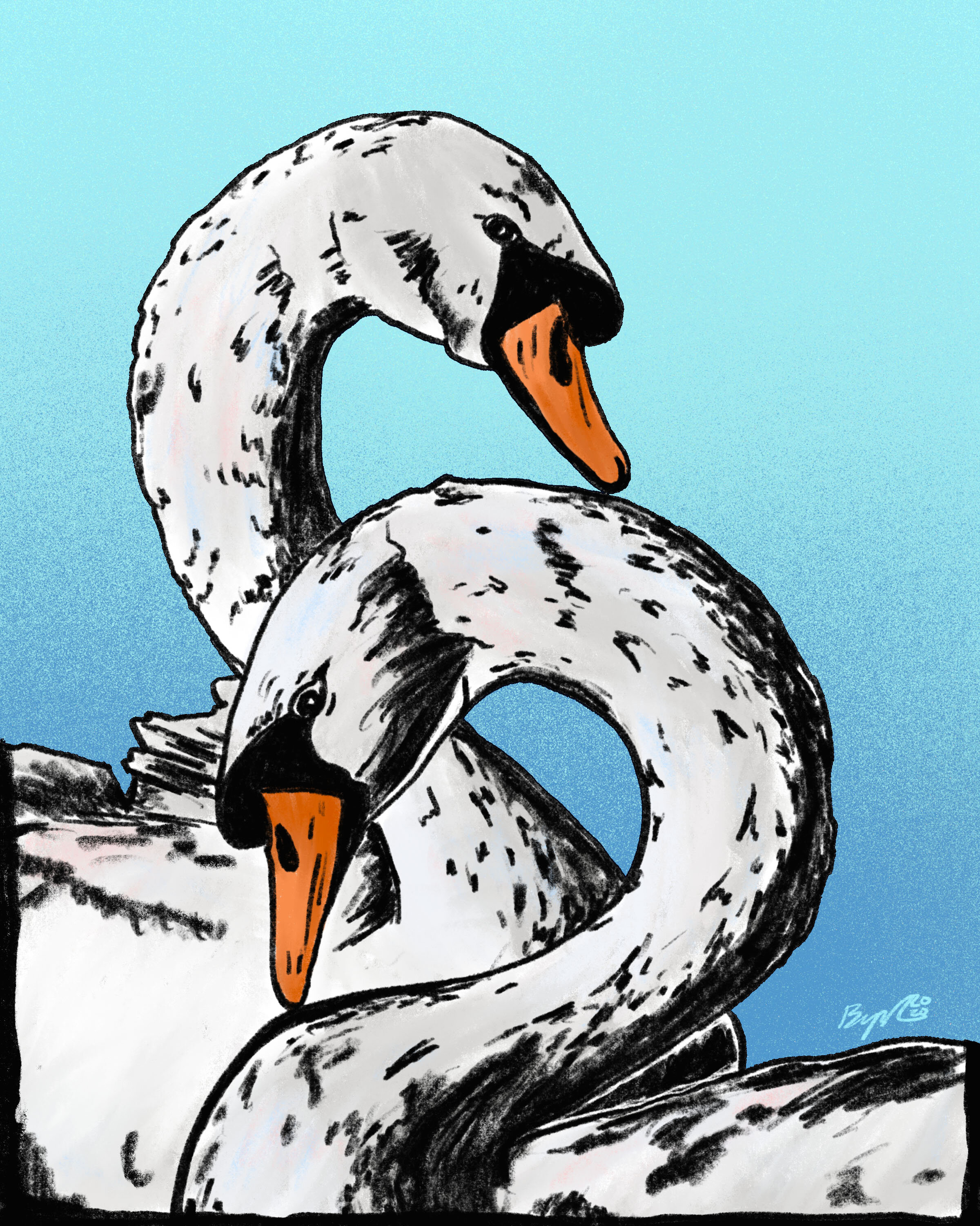
After I made this everything seemed to click, and I started making more here. The most resemble the simple outline style, however instead of just outlining I treat the black layer or “key layer” like a block print and just being a little more loose with the drawing since using the 6b pencil I can have some line variations. Then for the color I try to keep more simple and less blending, I always have the idea of a multi color block print in mind. I mainly done some animal portraits, but I’m hoping to take it to all aspects of my illustration. I think it will be great to try some conceptual pieces and merge the folk elements into this as well.
I hope you enjoyed this breakdown on a years worth of progression! It’s great to see everything on one page and see the how the pieces evolved. All of these new pieces are available on my shop, as well as some older ones that are on sale! They make a perfect little Christmas gift! My next blog post will be summarizing my block prints I made this year.
Thanks for reading, I’ll be back before the end of the year. Enjoy the Holidays and keep safe!
Bryan.
